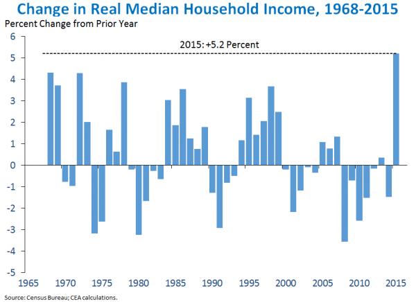
While campaigning for Hillary Clinton this week, President Obama announced new Census Bureau numbers on Median household income. A supposed 5.2% increase over 2015, the biggest increase in real wages (inflation adjusted) since 1967 when they started collecting this data.
The release of these numbers seemed very convenient, less than two months before the election.The Census Bureau and Obama failed to mention a key fact buried in the footnotes of the 70-page report: They used “redesigned income questions” to skew the results in their favor, as shown below:

Americans expect that as a non-partisan entity the Census Bureau would put this information about their data collection methods in their press release, but that didn’t happen.
Also: The Bureau of Labor Statistics just released their new average weekly wages data from the first quarter of 2016 which reports a 0.5% yearly decrease in wages. What’s really going on here?

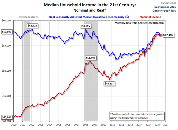
First of all it should be noted that the Census Bureau data is actually from 2015 while we are already at the end of the third quarter of 2016, and a lot has changed since then. The only group that actually has current data is Sentier Research. Sentier Research is a statistics research group that releases monthly reports on US incomes. They are founded and run by ex-Census Bureau statistics division employees.
The influential finance blog Zerohedge tipped us off that the census bureau actually redesigned some of the questions they use to measure the income. Their report footnotes state: “The 2014 CPS ASEC included redesigned questions for income and health insurance coverage. All of the approximately 98,000 addresses were eligible to receive the redesigned set of health insurance coverage questions.”
Starting in 2014, the Census Bureau began to “collect the value of assets that generate income if the respondent is unsure of the income generated.” And the government started to use “income ranges” as a follow-up for “don’t know” or “refused” answers on income-amount questions. These changes are hidden quite deep in the footnotes of the original Census report.
What really made our alarm bells ring on the figure Obama used in his stump speech for Hillary was the new data from the Bureau of Labor Statistics on the weekly wage changes from the first quarter of 2016. Their report shows that 167 of the 344 largest counties had weekly wage decreases. The average of all 344 largest counties was a decrease of 0.5%!

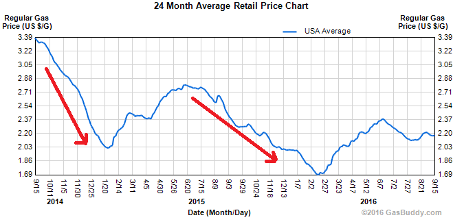
The data from Sentier Research is monthly, with the most recent data release from July 2016. Gordon Green from Sentier Research was quoted by the New York Post as admitting that indeed the 5.2% figure seems correct but that since then it has slackened off significantly. Next to that, Gordon Green said that the gasoline prices were a huge factor for increases in median household income.
Gas that has dropped in price like a brick since 2014 might have been behind the high numbers in 2015. However, now that gasoline prices are rising slightly again these gains have evaporated.

It seems that this 5.2% increase might be explained by just these changes. What’s even worse however is the fact that current data shows a significant slowdown in growth. Even with the changed questioning.

Obama’s claim to have “the most transparent administration in history” is again rendered laughable.

